Native Popover
Historically, Popovers are done with just vanilla javascript, then there was Jquery modals, then you would do it with manipulating the DOM, then could be simpler with Advance libraries or frameworks like Angular, React, Vue, among others.
But, most of the time you just want simple implementation that could be customized more without scaffolding an app with bundlers. Here, It’s just an HTML file, and The Web Standards have new native solution to this.
We could add some events could be added too, if you want more interactivity. I’ll be using tailwind, so you could copy paste all you like, and it would not cascade the styling.
Simple
<!doctype html>
<html lang="en">

<head>
  <meta charset="UTF-8" />
  <meta name="viewport" content="width=device-width, initial-scale=1.0" />
  <title>simplepopover</title>
  <script src="https://cdn.jsdelivr.net/npm/@tailwindcss/browser@4"></script>
</head>

<body>
  <button popovertarget="popover-el">Open</button>
  <article id="popover-el" popover>
    <button popovertarget="popover-el" popovertargetaction="hide">Close</button>
    <section>
      Lorem, ipsum dolor sit amet consectetur adipisicing elit. Expedita, pariatur.
    </section>
  </article>
</body>

</html>
Example:
You can attach popovertarget attribute to any buttons with the id of the popover as the value. The button with that attribute can have another attribute popovertargetaction as well to indicate what action it is going to trigger, the values could be hide or show, and the default is show. These attributes can be anywhere the dom so long as both of them are declared together.
When you try to click that Open above, it would popup a div from this site. And when you click the Close button from that popup it would then close the popup. You could try to press the Esc button, or click outside the bounds of the element to close the popup too.
As you can see the interactivity of these Modal, Dialog, Popup, Popover can now be written declaratively. No need to import third party library for this simple trick.
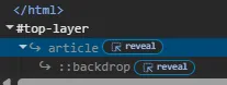
Let’s analyze the tags and attributes more. We can put a popover attribute to a HTML tag. Looking at Chrome Dev Tools it also indicates that the <article> tag is a popover.

And when we click that Open button it will have a top-layer marked on it too.

Now, If you look at the code, the popover attribute of the div is telling the entire document that its id (popover-el) is going to be on top of everything else, even the <html> tag.
Styling
<!doctype html>
<html lang="en">

<head>
  <meta charset="UTF-8" />
  <meta name="viewport" content="width=device-width, initial-scale=1.0" />
  <title>simplepopover</title>
  <script src="https://cdn.jsdelivr.net/npm/@tailwindcss/browser@4"></script>
</head>

<body>
  <div class="bg-white text-black w-full p-4 rounded-md">
    <button popovertarget="popover-el2" class="bg-yellow-200 rounded-md p-2">Open</button>
    <article id="popover-el2" popover class="bg-white/70 backdrop-blur-md rounded-md p-10">
      <button popovertarget="popover-el2" popovertargetaction="hide" class="bg-yellow-200 rounded-md p-2">Close</button>
      <section>
        Lorem, ipsum dolor sit amet consectetur adipisicing elit. Expedita, pariatur.
      </section>
    </article>
  </div>
</body>

</html>
Example:
Here, I should point out that the popover pops at the middle of the screen. So, no need to worry about centering a div anymore. It won’t be cascaded by the css because it is rendered at the top. So, no need to set z-index, overflow, position, and all those past struggles.
Stacking popovers
<!doctype html>
<html lang="en">

<head>
  <meta charset="UTF-8" />
  <meta name="viewport" content="width=device-width, initial-scale=1.0" />
  <title>simplepopover</title>
  <script src="https://cdn.jsdelivr.net/npm/@tailwindcss/browser@4"></script>
</head>

<body>
  <button popovertarget="popover-el3" class="bg-yellow-200 rounded-md p-2">Open</button>
  <article id="popover-el3" popover class="bg-white/70 backdrop-blur-md rounded-md p-10 text-black">
    <button popovertarget="popover-el3" popovertargetaction="hide" class="bg-yellow-200 rounded-md p-2">Close</button>
    <section class="flex flex-col">
      <h1>Stacked Popover</h1>
      <div>
        <button popovertarget="popover-el4" class="bg-yellow-200 rounded-md p-2">Open Another Popover</button>
        <div id="popover-el4" popover class="bg-white/70 backdrop-blur-md rounded-md p-10 text-black">
          <button popovertarget="popover-el4" popovertargetaction="hide" class="bg-yellow-200 rounded-md p-2">Close</button>
          <section>
              Lorem, ipsum dolor sit amet consectetur adipisicing elit. Expedita, pariatur.
          </section>
        </div>
      </div>
    </section>
  </article>
</body>

</html>
Example:
Note: make sure to style the contents of the popover target because css treats it as a layer on top of the rest, and does not cascade the styles where it is placed. And that’s fine.
In this example, The popover can have multiple popovers stacking over another.
When you’ve opened both popovers, you could also click the outer popover’s close or away from those 2 popovers to close both popovers at once.
It also shows that the popovertarget attribute will determine which tag has the matching id attribute.
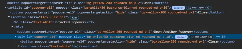
Upon clicking the second popover, Looking at the Dev tools shows that there’s another top-layer (2) marked on the inner popover.
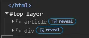
The order of the layers on top of HTML, also determines which gets the higher z-index as usual. The last element means top-most element.
Sticking the popover beside the button/trigger (Anchoring)
The popover can also be used to stick beside the button to display some context.
It can be stick to the popover around the triggering button.
Just give the trigger button the anchor-name style attribute and must corresponds to the position-anchor styles attributes.
It can be anything unique that doesn’t conflict with another anchor-name.
Set the position-anchor to the value of the anchor-name we just made.
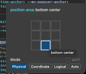
And finally, the position-area of the popover can be assigned at the left, right, top, bottom, and center area of the button.
...
<button popovertarget="my-popover-id" style="anchor-name: --my-popover-anchor"
  >press</button
>
<div
  id="my-popover-id"
  popover="auto"
  style="position-anchor: --my-popover-anchor; position-area: bottom center;"
>
  Lorem, ipsum dolor sit amet consectetur adipisicing elit. Expedita, pariatur.
</div>
...
Example:
Lorem, ipsum dolor sit amet consectetur adipisicing elit. Expedita, pariatur.
Listen to when popover action toggles
...
  <button popovertarget="popover-el5" class="bg-yellow-200 rounded-md p-2">Open</button>
  <article id="popover-el5" popover class="bg-white/70 backdrop-blur-md rounded-md p-10">
    <button id="popover-closer" popovertarget="popover-el5" popovertargetaction="hide" class="bg-yellow-200 rounded-md p-2">Close</button>
    <section class="flex flex-col">
      <h1>Popover</h1>
        <section>
          Lorem, ipsum dolor sit amet consectetur adipisicing elit. Expedita, pariatur.
        </section>
    </section>
  </article>
  <script>
    document.addEventListener("DOMContentLoaded", () => {
      document.getElementById("popover-el5").addEventListener("toggle", ({oldState, newState}) => {
        alert(`[toggle states] old: ${oldState} new: ${newState}`)
      })
      document.getElementById("popover-el5").addEventListener("beforetoggle", ({oldState, newState}) => {
        alert(`[beforetoggle states] old: ${oldState} new: ${newState}`)
      })
    });
  </script>
...
Example:
Popover
Finally, you could also listen to the events on or before the popover toggles.
Drop-down list
This anchoring popover mechanism is particularly perfect for dropdowns. As you can imagine input fields instead of select, and popovers instead of options.
...
<label
  id="my-popover-label"
  for="my-popover-anchor1"
  popovertarget="my-popover-anchor1"
  style="anchor-name: --my-popover-anchor1"
  class="border rounded-lg shrink-0 flex flex-col py-1 px-2 focus-within:ring-2 focus-within:ring-offset-2 focus-within:ring-black focus-within:border-black"
>
  <span class="text-xs">stock</span>
  <input
    id="my-popover-anchor1"
    placeholder="Select a stock"
    class="outline-none focus:outline-none focus:ring-0"
  />
</label>
<div
  id="my-popover-id1"
  popover="auto"
  style="position-anchor: --my-popover-anchor1; position-area: bottom center;"
  class="bg-transparent top-2"
>
  <div class="flex flex-col p-1 gap-1 border rounded-lg bg-white text-black">
    <button id="btn1" data-stock="AAPL" class="grid grid-cols-3 items-center gap-1 p-1 rounded-lg hover:bg-black/20">
      <div>AAPL</div>
      <div class="text-sm font-semibold">$350.25</div>
      <div class="text-green-700 text-sm font-semibold">5.53%</div>
    </button>
    <button id="btn2" data-stock="GOOG" class="grid grid-cols-3 items-center gap-1 p-1 rounded-lg hover:bg-black/20">
      <div>GOOG</div>
      <div class="text-sm font-semibold">$287.18</div>
      <div class="text-green-700 text-sm font-semibold">5.53%</div>
    </button>
    <button id="btn3" data-stock="MSFT" class="grid grid-cols-3 items-center gap-1 p-1 rounded-lg hover:bg-black/20">
      <div>MSFT</div>
      <div class="text-sm font-semibold">$55.39</div>
      <div class="text-green-700 text-sm font-semibold">5.64%</div>
    </button>
  </div>
</div>
<script>
  const p1 = document.getElementById("my-popover-id1")
  const i1 = document.getElementById("my-popover-anchor1")
  document.getElementById("my-popover-label")?.addEventListener("click", () => (p1 && p1.showPopover()));
  setValue(document.getElementById("btn1"));
  setValue(document.getElementById("btn2"));
  setValue(document.getElementById("btn3"));
  function setValue(f) {
      f && f.addEventListener("click", () => {
          if (i1) i1.value = f.dataset.stock ?? "";
          for (b of document.querySelectorAll("button[data-stock]")) b.classList.remove("ring");
          f.classList.add("ring");
      });
  }
</script>
...
Example:
In the Dropdown example, It is still required to do selected and clicking event it in javascript.
But it is not that bad anymore compared to what workaround somebody would do to a select tag.
Native Popover is all you need
There is now simple way to implement Modals, Dialogs, Popups, Popovers whatever you call it, and you don’t need to import libraries for this anymore. Just your HTML and CSS. The popover can have styling into it. It could stack over another popover. It could anchor your popover with the trigger button. It could even listen to the events during popping over or after. And, It could also be used as a dropdown alternative.
Of course, you can have interactivity too.